User guide
Learn how to navigate the interactive dashboards, use data filters to create and download customised displays and get a better understanding of statistics
Navigating
Using tabs to navigate through dashboards within each objective.
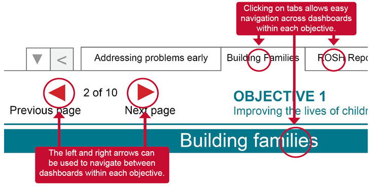
Labeled tabs appear at the top of each dashboard. You can navigate to a specific dashboard by clicking on the tabs within each objective (for the annual reports) or topic area (for the quarterly reports). Please note that it is not possible to jump from one objective to another objective or between the social housing and children and young people quarterly reports using the tab function. To do this you need to use the navigation panel on the left of the screen. This provides access to each of the six objectives and district profiles for annual data, and to the respective quarterly reports.
Page referencing on the top left of the dashboard (the red arrows found below the tab selectors) can also be used to navigate between dashboards within objective or topic area. The numbering system relates to the number of dashboards available within each objective or quarterly report.
Customising
Using data filters to create customised displays
Using filters narrows the data shown in a view to focus on relevant information. Filter options vary according to each report. Note that not all reports have a filtering function. Where available, filters are located above each related graph.
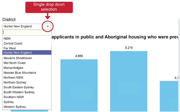
To customise reports, click on the drop-down arrow key on the filter and select the filter categories required. Where multiple filters exist for a report, each filter can be selected to identify what data are included or excluded from the view.

Two types of filters are used in FACS Statistics - single drop down and multi select:
- single drop down filters allow for selection of a single value only within the filter
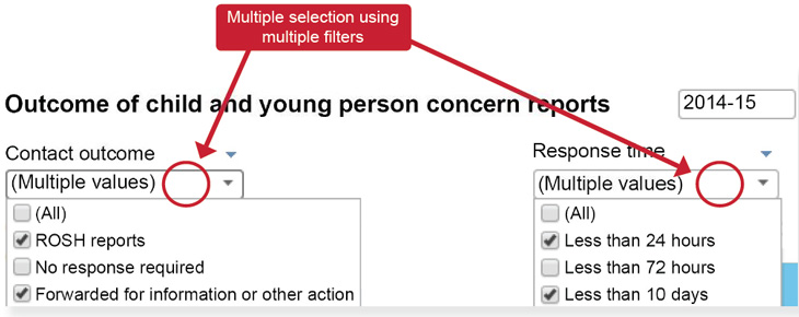
- a multi-select filter may also be available for one or more filters in a graph. This allows for selection of multiple values within the one filter
The use of multi-select filters in the example below allows for a report to be customised to meet individual requirements.
Interpreting
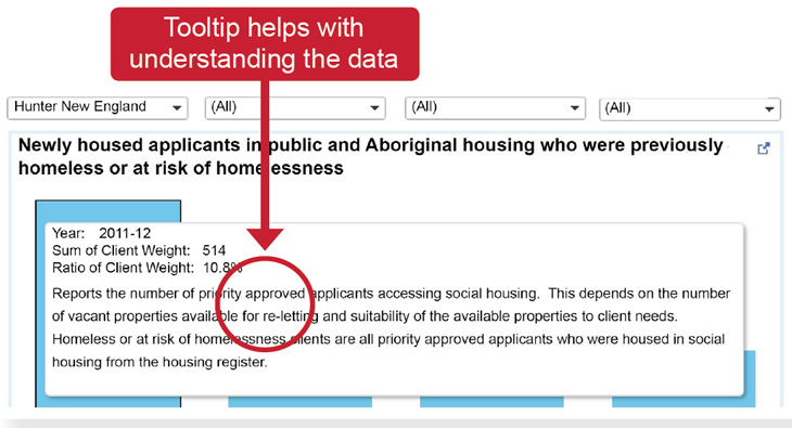
Aiding interpretation of graphs using the tool tip facility
To assist in the interpretation of data, data definitions and explanatory notes have been added to tool tips. By hovering the mouse pointer over a graph or infographic, a tool tip appears showing relevant notes about the data. For further clarification, a glossary of terms and metadata can also be accessed on the website which will assist in understanding FACS data.
Understanding and interpreting changes to data
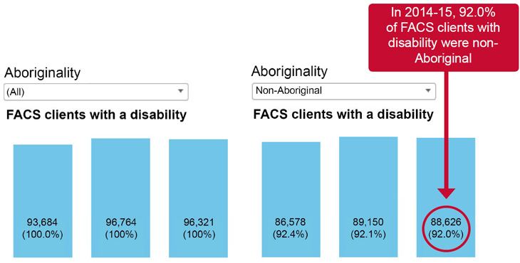
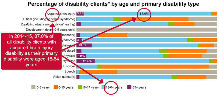
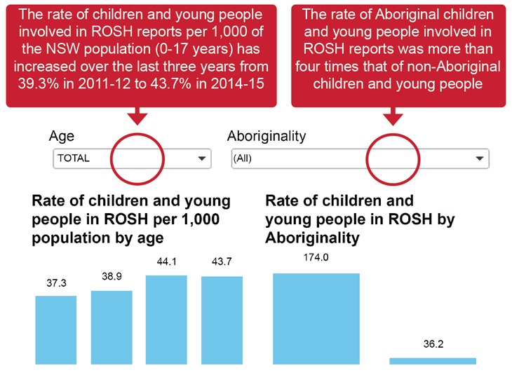
By default, all data presented on graphs are for the NSW total. The majority of graphs show the total numerical value and the related percentage. The default setting for drop down filters is ALL which represents the NSW total, with the corresponding percentage appearing as 100%. Once filters are applied to data, the numerical value and the percentage will change to reflect the filter selection(s).
Example 1
Example 2
Example 3
Downloading customised graphs
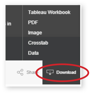
Data from FACS Statistics can be exported in a number of different formats. The entire dashboard can be exported as a Tableau workbook, PDF or image. If part of the graph is selected, it can be exported as a Crosstab or Data (both in CSV format)
